Moxxy UI: May 2024 progress report
09/06/2024 · 5 min
Let's start with a little announcement: from now on, I'll be publishing my .penpot file in the moxxy/design repository on Codeberg on a monthly basis, so that everyone can tinker with the interface to their heart's content! I should have done it from the start, but better late than never!
The goals I had set myself in the preceding months were the following:
- make the colors more vibrant
- make the "Chat" button stand out more (Home screen)
- fix the feeling of "imprisonment" that is caused by having a background image in the chat screen
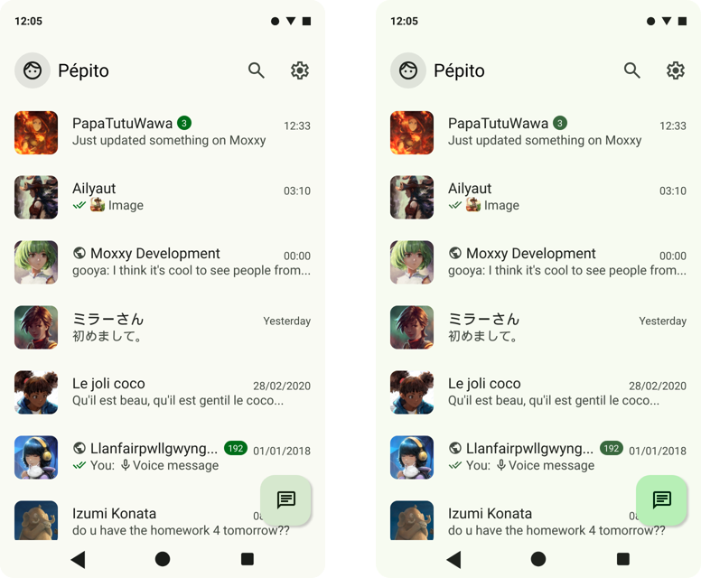
The issue with the dull colors was resolved last month when I realised that the colour palette generated by the Material Theme Builder was wrong. So I corrected it and got back to colors that were brighter and easier to distinguish.

before/after
This has also enabled the "Chat" button to stand out properly.
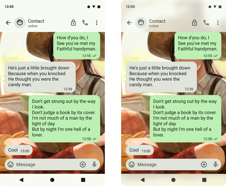
I then tackled the chat screen. Here I found that the header and the system and navigation bars enclosed the background in a rigid frame, making it impossible to imagine that the image exists beyond the borders of this frame.
Now, I admit that this is largely a matter of personal taste, but I attach a certain importance to the idea that it should be possible to imagine the interface beyond what the screen of our device lets us see. To put it simply, you could imagine an application as a house, and its various screens as rooms. The interface buttons are like doors, and the transition animations represent moving from one room to another. At the moment, the chat screen gives me the feeling of being in a windowless room, but with a pretty picture hanging on the wall. My aim is to turn this picture into a window.
And to do that, I had to break the frame, i.e. the header and the system and navigation bars of Android.
It wasn't possible to reduce the opacity of these bars or make them completely transparent for reasons of legibility. The solution I've found for the time being is a blur effect in the style of the css filter backdrop-filter: blur() which allows me to emphasise the existence of the background beyond the boundaries of the interface without hindering the reading of the information above it.

I would have liked to add the blurred message bubbles, but it was already a lot of tinkering to get that effect on Penpot.
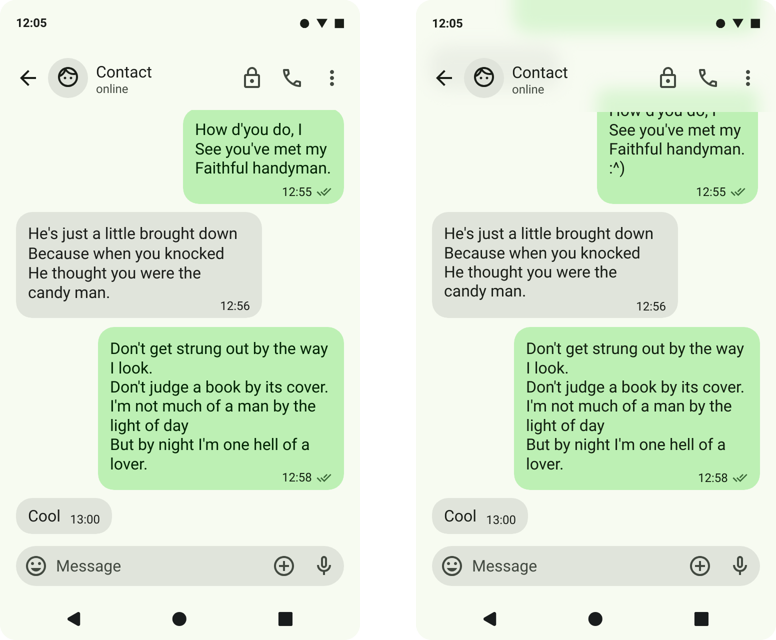
For the science, I tried to apply the same effect without a wallpaper. For a moment I thought I'd switched to iOS, but the Material Design 3 colours really give the impression that we're on to something else, halfway between flat design and glassmorphism. I'm not entirely sure how well it fits in with the rest of the interface, but I'm not closing the door on the idea just yet.

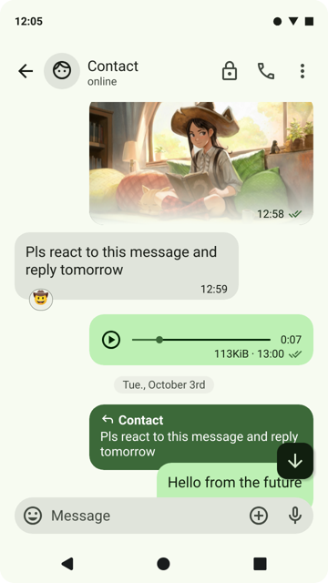
Finally, I worked on the various elements that can be found in chat screens, trying to get away from what other apps might do, particularly WhatsApp.

Next time, I'd like to work on the following points:
- design of the text bubbles when you send a file and when you send your location
- design of the drop-down menus that appear when you use the various buttons on the chat screen
- design of the menu that appears when a chat bubble is long-pressed/li>
- design of message bubbles with errors (message not encrypted, sending error, etc.)
If you have any remarks, suggestions, solutions or comments, I'd be delighted to hear from you by replying under the Mastodon post, or by sending them to me by email or XMPP!
:^)