Moxxy UI: April 2024 progress report
08/05/2024 · 3 min
April has been a busy month, partly due to a Windows Defender Trojan alert that gave me a good excuse to wipe my entire disk and switch to Linux. So this post will be short and without any major news.
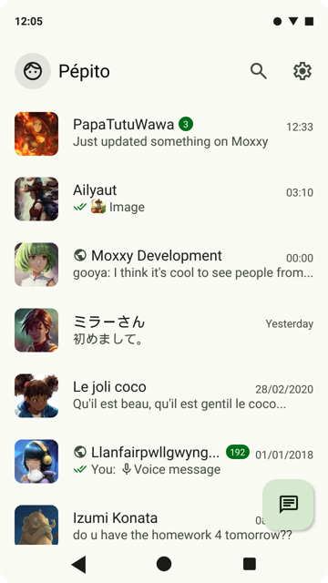
One of the things I wanted to work on was color. The interface seemed dull overall, and the "Chat" button not very visible.
The best way to find out was to simulate real-life conditions!
So I added profile photos (by David Revoy), notifications and icons.

All in all, it's not so dull!
I also took the opportunity to add the image preview feature created by PapaTutuWawa.

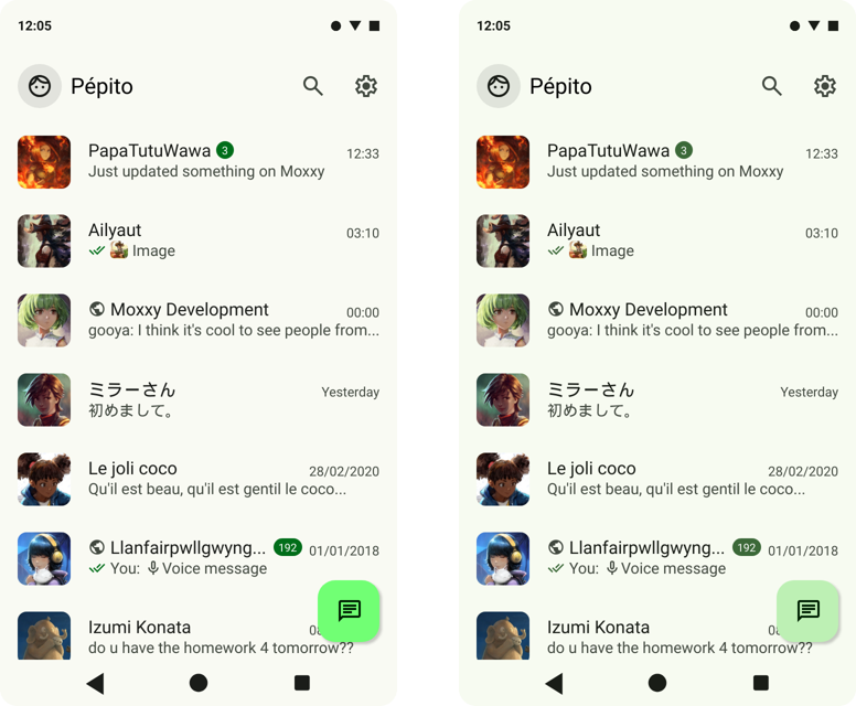
Regarding the "Chat" button, long story short, I struggled for hours because of a color palette incorrectly generated by the Material Theme Builder. The primaryContainer token that's recommended for this kind of button (a Floating Action Button) was flashy green, whereas when the palette was generated again with the same seed color, it was duller. I don't know if Google changed the code between the time I generated the first palette and today, but the difference is obvious.

Left: wrong palette / right: correct palette
Furthermore, I tried to enter the same seed color as my Android phone's theme in order to understand which tokens Google apps used in which situations, but the colors didn't match.
In short, it's a big mess, but at least I've been able to correct my color palette for the future.
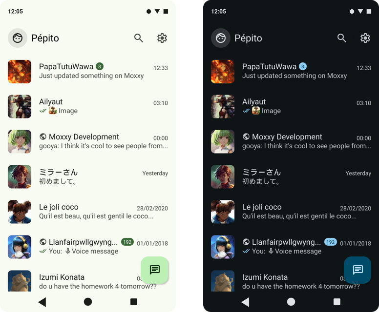
So here's the current state of the main screen in light and dark.

I hope to have more time next month to do more than just change colors. In the meantime, if you have any feedback or suggestions on the UI, don't hesitate to send them to me via XMPP, email or in reply under the Mastodon post!
:^)