Moxxy UI: March 2024 progress report
07/04/2024 · 7 min
Although I haven't communicated much about it, I've been working on a new interface for Moxxy since October 2023. I created this blog mainly to present my work on this open source project.
My aim was to create an XMPP client interface that's more modern and easier to use than the ones that currently exist, because I find it very hard to recommend XMPP to my friends and family as things stand. Maybe I'm the one who's particularly bad at explaining, but the mere mention of "server" scares 9 out of 10 people away.
I chose to contribute to Moxxy because PapaTutuWawa, its developer, suggested it to me, and because Moxxy is written in Flutter, which is a language that is particularly well-suited to the creation of cross-platform applications (and I think that a cross-platform application would help enormously with the spread of XMPP to the general public).
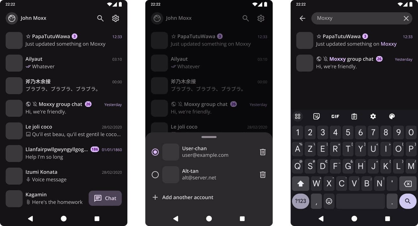
So I started working on Inkscape in 2023, and came up with this.


Unfortunately, Inkscape wasn't really suited to the task, and I ended up spending more time making documents to explain the designs than creating new ones. On the advice of a more experienced UI designer, I decided to use Penpot. Well, this designer had recommended Figma, but it didn't make sense to work on an open source project with a proprietary tool.
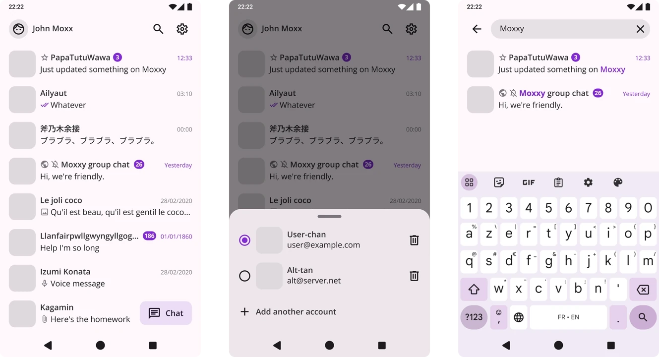
So here's the home screen I created using Penpot in January:

The result wasn't quite the same. It has to be said that I tried to correct a number of beginner's mistakes I'd made on Inkscape:
- Instead of using the Open Sans font, I switched to Roboto (the default font on Android)
- Instead of doing my designs in 1080x1920, I switched to 360x640, which is the standard format for mobile interface design.
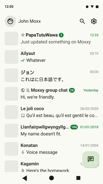
I've also changed the colour of the interface. Well, I haven't really changed it, I've just changed the theme, because the aim is for users to be able to choose their own theme with Material You!
For my part, I switched to a light theme and green so as not to get too used to the dark theme and to check that the interface works well with several themes.
In February 2024, I got a new job! I'm now a graphic designer, 3D artist and... UI designer! I took advantage of this new role to delve deeper into the Material Design documentation, which is integrated directly into Flutter (if I've understood correctly).
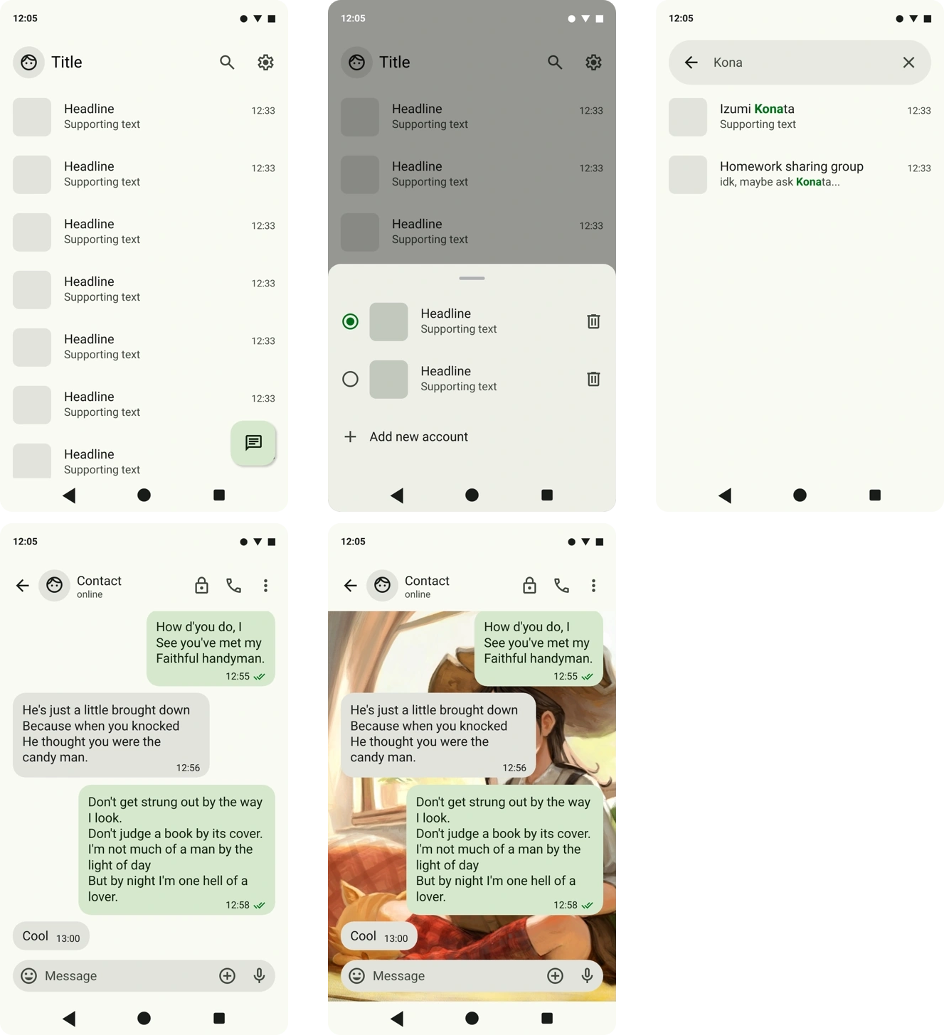
That's when I realised that I'd made some new mistakes, particularly with the choice of colours. So I spent some time changing all my components and replacing them with the default Material Design components. Here's the result:

The interface now seems much cleaner and more rigorous.
I'm just worried that following the guidelines to the letter will make the design 'personality-less'. But that's a concern I'll save for later.
Now, the points I think need more work:
- The colours are generally very calm and soothing. That's fine, but I'd like to give the design a bit more energy so that it catches the eye and makes people who don't use it want to use it. In my dreams, I'd like people to look over a user's shoulder when they're using Moxxy and think "Wow, that's a stylish app, I want the same one" (I've got a few ideas for that but I'll keep it for later, let's do something functional first).
- The "chat" button doesn't stand out enough for my taste. But the theme colours are a bit limited and it's either that or a flashy green that clashes with the rest.
- Although David Revoy's illustration is beautiful, I think the background behind the bubbles in the conversation looks very ugly. I was trying to keep the application 'immersive' by taking up the whole screen, but this is quite the opposite. The wallpaper is completely trapped between two rectangles, and you feel trapped by extension. I haven't found a solution to this yet, as I can't make the header transparent or semi-transparent for legibility reasons.
So that was my first progress report on the Moxxy interface! I plan (and hope) to do one every month, a bit like Thunderbird does with the K9-Mail transformation. It's both a good way of encouraging myself to work regularly and, I hope, drawing attention to this great project.
If you have any remarks, suggestions, solutions or comments, I'd be delighted to hear from you by replying under the Mastodon post, or by sending them to me by email or XMPP!
:^)